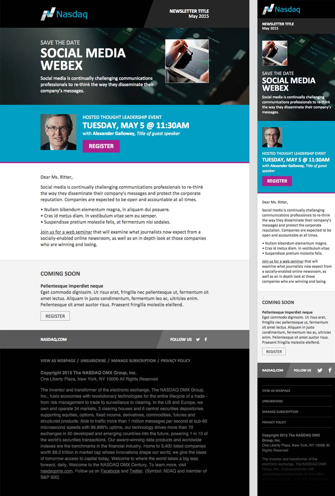
NASDAQ OMX: A custom-fit mobile experience
Responsive web design (RWD) has become the industry standard for delivering the right web experience for the right screen size at the right time. And it’s not just limited to websites and landing pages. The same technique can be used to make emails look great on any sized screen too. Many marketers are behind the curve in fully embracing RWD, especially for email. Not NASDAQ OMX.

NASDAQ OMX provides trading, exchange technology, information and public company services across six continents. As the creator of the world’s first electronic stock market, its technology powers more than 70 marketplaces in 50 countries, and one in 10 of the world’s securities transactions. Clearly, its audience is vast, international and, largely, mobile.
Many marketers are behind the curve in fully embracing RWD, especially for email. Not NASDAQ OMX.
When the NASDAQ OMX team refreshed their corporate brand look, they seized the opportunity to create new email templates that not only matched their new brand, but also matched buyers’ rising expectations for better mobile experiences.
They developed a new responsive email master template (that lives right within their marketing automation platform, Eloqua) to meet a variety of marketing purposes, including a newsletter and promotion of events and webinars. Their new responsive emails are smart enough to deliver different experiences for different sized screens, all from one code base. They’re also capable of hiding or relocating certain content elements under certain situations, helping focus mobile viewers’ attention on what’s most important when screen real estate gets tight.
Now, each reader receives an entirely custom-fit email experience, just right for the device that is used to view it.
David Chirakal heads up our marketing automation team, and Tristan Holmberg is passionate about the possibilities of responsive email design to provide a better mobile experience.