Redesigning a real estate giant
It was supposed to be an update to an existing website, more a “re-skin” around existing content than a ground-up redesign. But what the project produced was a digital design that helped galvanize a company.
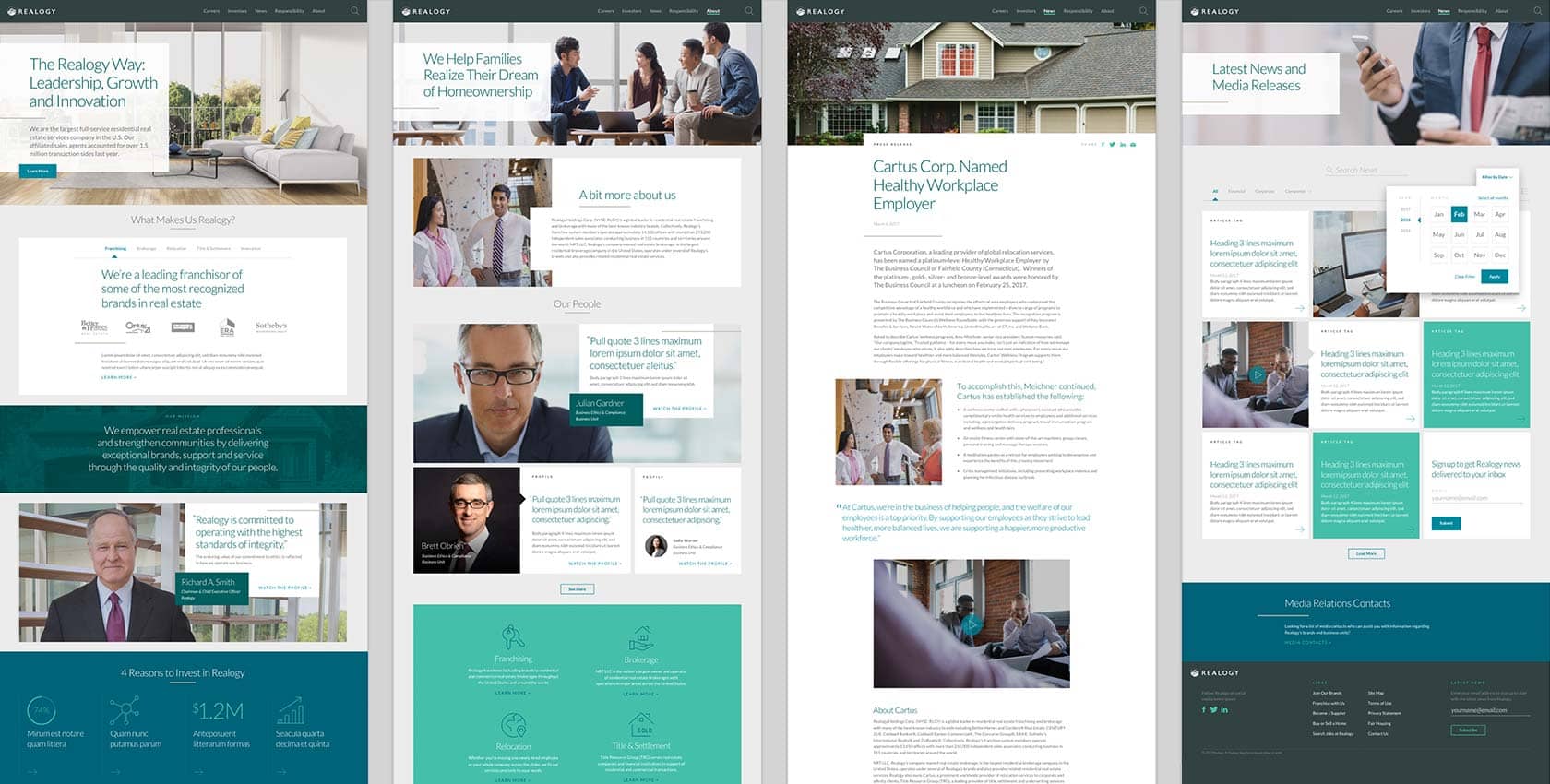
Realogy is one of the world’s leading and most integrated providers of residential real estate services, and includes well-known industry brands such as Better Homes and Gardens® Real Estate, CENTURY 21®, Coldwell Banker®, ERA® and Sotheby’s International Realty®. Spurred by an increasingly dynamic industry, Realogy engaged Quarry to develop a new, more contemporary look and feel for its website and to move the website to a new content management system (CMS). Adding a sense of urgency, the migration needed to be completed in advance of two hard deadlines: an Investor Day for Realogy—an opportunity for the company to present a deeper dive into the company’s results and strategy for Wall Street analysts and investors—and an internal town hall meeting.
With the pressure of ‘disruptive’ new companies, this (website) is a testament to the important service that committed real estate professionals provide. Well done!
Shyrl Lorino, NRT-Coldwell Banker Office Manager
The tight timeline left little room for hiccups or hurdles. If you’ve been involved with digital design projects before, you already know the shortcomings of conventional processes. Wireframes-based approaches allow for quick iteration with lower investment up front, but they don’t always give clients a good sense of how their product is going to look and feel. It’s much like buying a house based only on a blueprint. Quarry’s approach in this case introduced higher-fidelity design explorations early in the process; by doing that, we engaged the Realogy team sooner in the process.
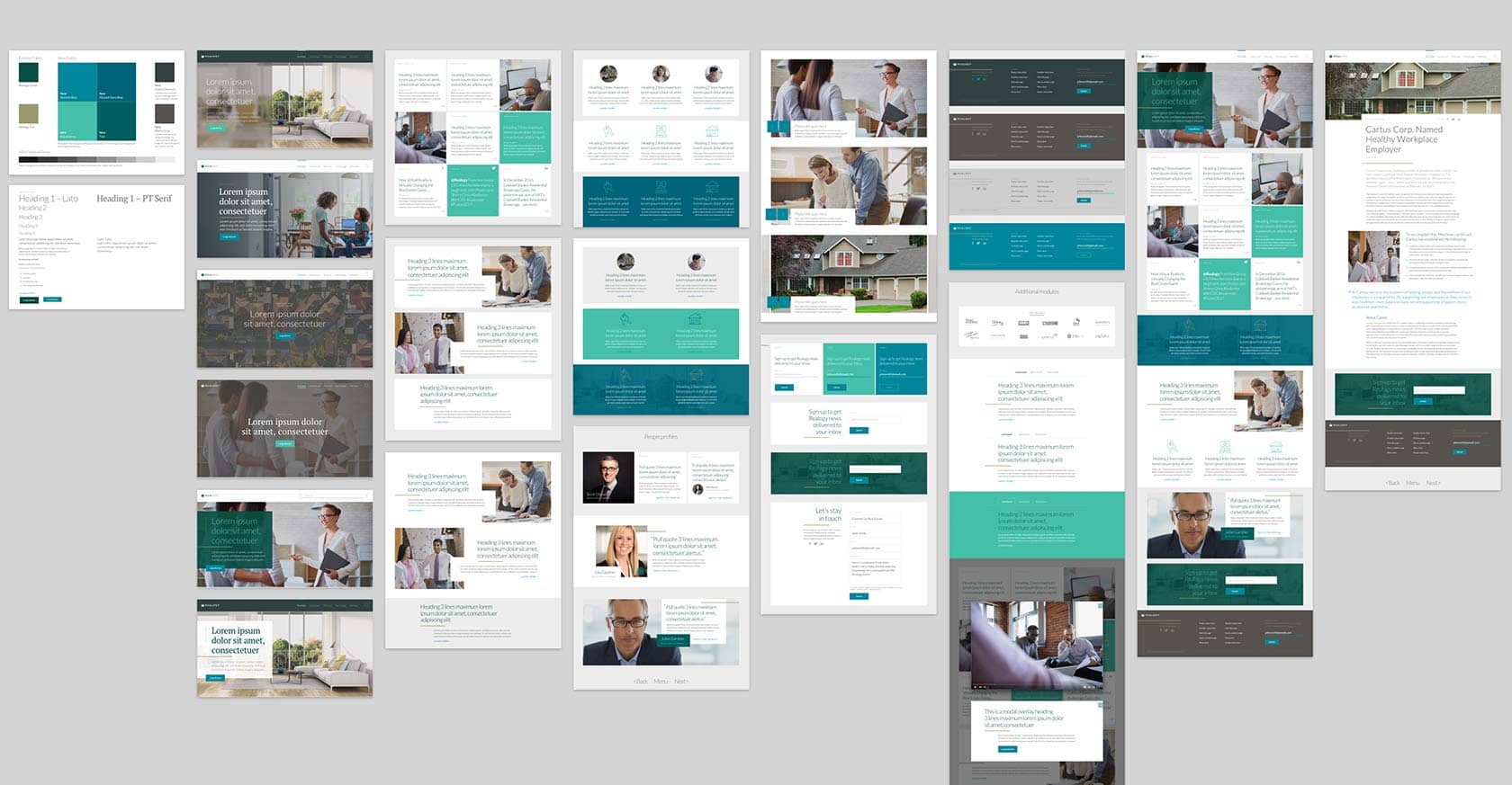
To accelerate the design process, we used atomic design as a guiding principle. This approach breaks web pages into smaller components or modules (for instance, the footer and call-to-action buttons), each of which the designer can quickly visually explore, without having to consider the integrated whole just yet or wait for finalized copy.
Then, to share these explorations with our partners at Realogy, we used element collages. Element collages are a less formal, much faster way of sharing ideas. For instance, our first element collage captured our thinking on typography and a secondary color pallette (normally reserved for revisions to the style guide); visual style and feel (usually found in mood boards); and individual web page elements, both alone and in aggregate (information usually associated with composites). This approach meant we could iterate and share more quickly, ensuring our ideas aligned with the expectations of Realogy, while building a spirit of collaboration and a better sense of ownership on their part.

Early on, we reviewed other websites in the real estate industry. We identified exemplars and used these findings to recommend content types that Realogy might use to enhance their user experience—everything from people profiles to governance board structures to press releases. As we worked with our partners at Realogy, we were careful to ensure that each of these content types could be integrated into a unified and elegant design. So there were no unexpected content types and no need to jerry-rig solutions for unanticipated content.
As part of the modernization effort, we used micro-animations and other visual feedback elements to guide the user through the website. In some cases, content scrolls or flows into the field of view. In others, the content is gently revealed in response to a click. The net effect is that the visitor’s attention is drawn to the right content at the right time, and they gain a sense of control. In short, a great UX.
The responsive design of the site ensures that mobile visitors have an optimal experience, regardless of device or screen. The design acknowledges that mobile users are different from desktop users. To accommodate their distinct needs and expectations, Realogy offers an experience that is more than just a vertically aligned version of the the desktop site, one that’s more focused on speed and quick access to essential info.
In the back end, we worked with Realogy to integrate their site with outside systems, including PR Newswire and Nasdaq. We also advised them on a scheme to develop new content for the site.
“It’s a really great feeling to see something come to life that you know everyone on the team has been working hard on for so long,” says Nick Renda, Senior Manager, Corporate Communications at Realogy. “From design to development to managing funky integrations, APIs and RSS mail feeds and a hard deadline at the end, it all came together to create the outcome we were aiming for.”
The site received similar feedback from other employees and executives. “I just spent time on our new site,” wrote John Peyton, CEO of the Realogy Franchise Group, in an email. “The new site is a great reflection of our company, our brands and our strategy.”
It’s a testament to a new digital design when it acts as a mirror, enabling employees to see all the positive characteristics and values that their company embraces while suggesting a new direction forward. In this case, it’s also a great example of how a digital design partner can help move mountains and shift mindsets.
The new site is a great reflection of our company, our brands and our strategy.
John Peyton, CEO Realogy Franchise Group

